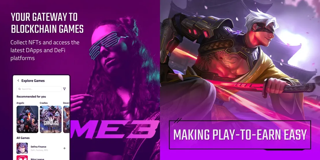
Me3’s goal is to enhance the lives of gamers by introducing them to Web3. The promise of play to earn, metaverse, and other Web3 technologies is tremendous however the industry is plagued by a lack of usability and accessibility. Me3 will change that by simplifying all the required functions into one wallet.

The Challenge

Me3 is Avarta rebranded to target gamers and those interested in the metaverse. The main challenge of the rebrand was finding a middle ground in style that would satisfy adults aged 20-35 without being a complete turnoff to older demographics.

Logo Design

Me + Web3 = Me3
The logo is a portmanteau meant to play on the idea of users having a unique identity in the metaverse. It is a Wordmark logo constructed by modifying the letterforms of the ‘Draco’ font. The font was chosen for its sharp edges and sheared profile, which typically are associated with eSports branding.
The arms of the ‘E’ and ‘3’ have been modified to look like the arrows of a ‘convert symbol’ to subtlely hint at the product being a wallet application.
The ‘M’ is used to determine spacing when placing the logo.
The unaltered ‘Draco’ font. Note how the ‘3’ is different.
Initial drafts. Option 1 is not far off from the final design.

Anime & Cyberpunk

The style and graphics of Me3 capitalize on the success of properties within the targeted demographic; such as League of Legend’s Arcane and Cyberpunk 2077.

Brand Collateral

Beyond the website, we assisted with the design of Me3’s investor deck and social media posts.

Get In Touch For A Complimentary Brainstorming Session

We’ll examine what you have now, and find the lowest hanging fruit.
Hopefully, together, we can uncover a clear path to a 10x growth trajectory.