A Thai law firm that deals almost exclusively with international clients, who seek legal advice to a start business in Thailand, or need help in other legal matters.

The Challenge

The ambitiousness and scope of this redesign project was enormous. The website needed to elevate the company’s image to a level that could compete with firms globally. The original site’s design and UX started at such a low place that there were many areas in need of improvement.
Old Homepage
New Homepage

Site Navigation

The original website lacked dropdown menus, which made it difficult to find specific services. This required opening a main category page and then accessing related pages in the sidebar.

On the new website, we added a mega menu with a list of links for each of the main categories.
The old website also had a portal page labeled “Other Practice Areas’. This was made redundant by the new mega menu and was removed.
The mega menu structure aided in the adoption of new hyper-specific service pages because they would no longer be difficult to notice or reach.

Typography

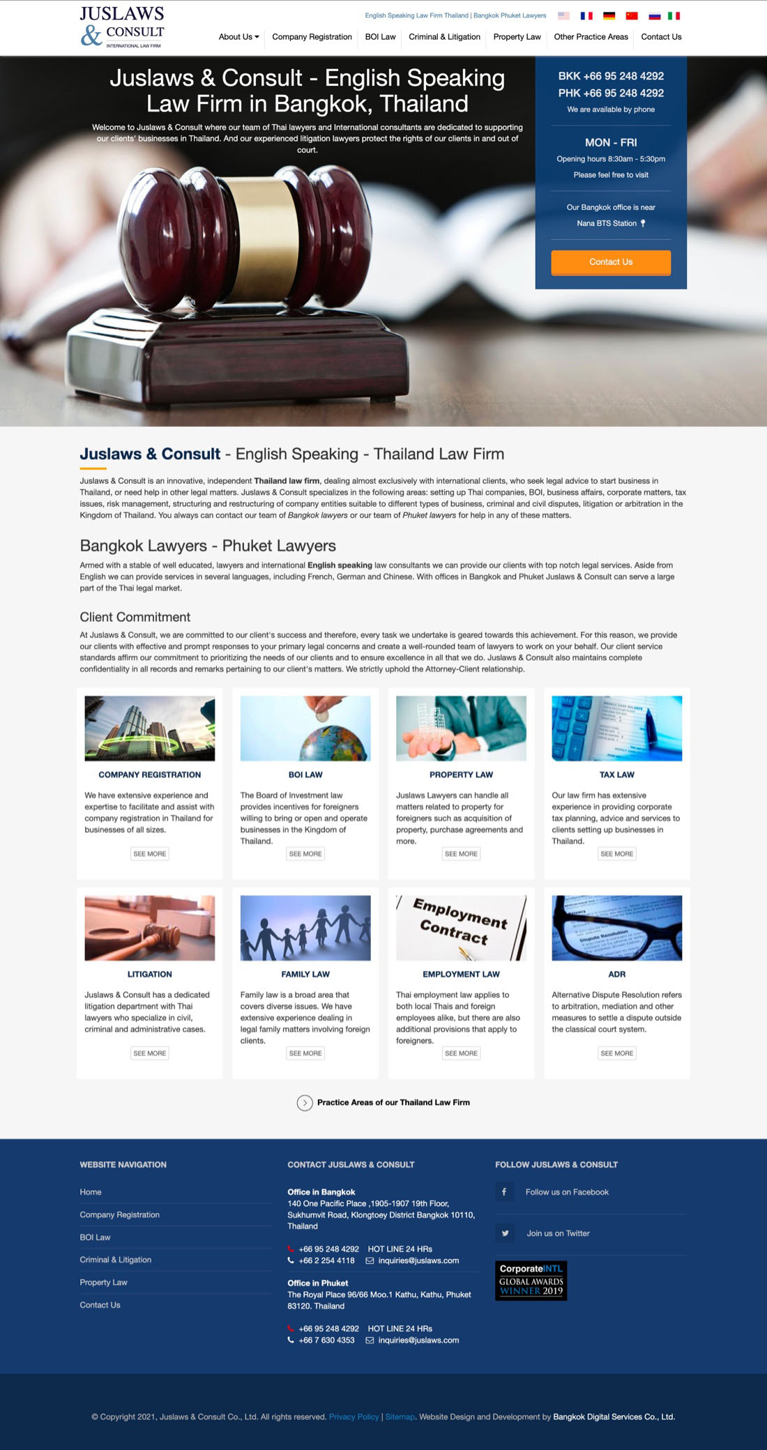
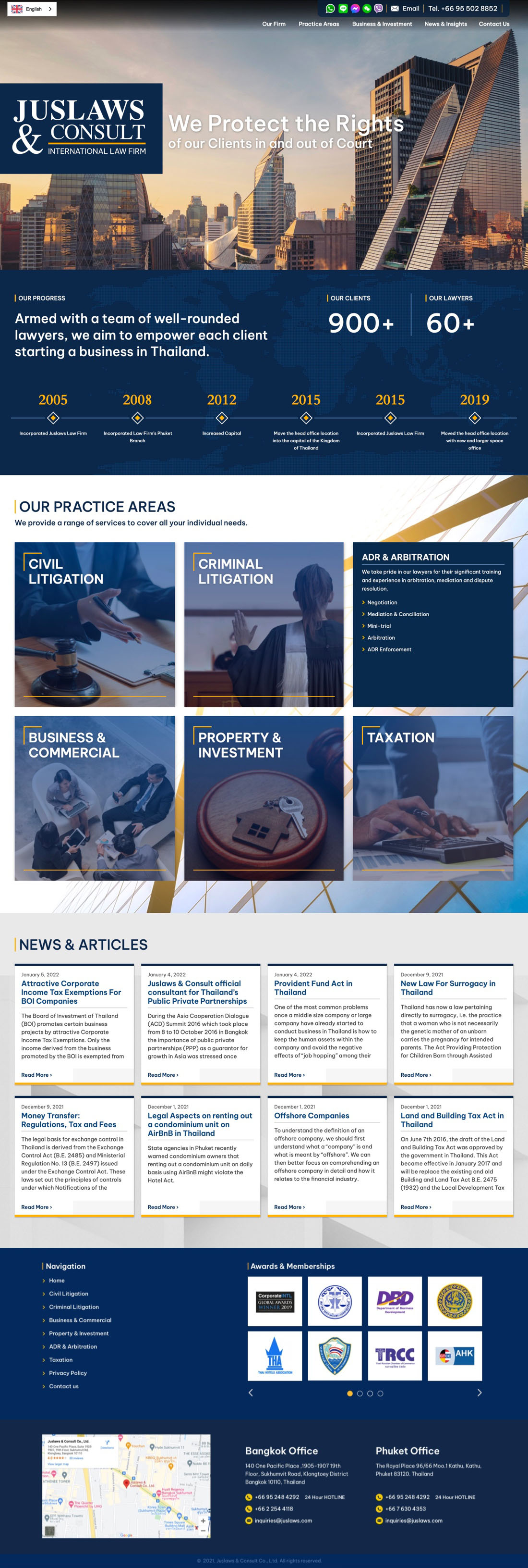
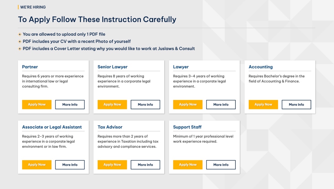
The primary font was changed from ‘Helvetica Neue’ to ‘Be Vietnam Pro’ so that the website would feel more contemporary. Geometric fonts are likely to remain popular as UI/UX practices continue to merge with web design.
For readability, we made it so text boxes wouldn’t take up the full length of a container. When a text box is very wide it slows down reading because the human eye has a hard time jumping to the beginning of the next line of text.
The old website used headings with split weights. This was removed because it created visual interest without meaning.
The new website uses headings with a single weight. A diamond is used as an anchor for the eyes instead of a yellow line.

Professional Look

Squares with sharp corners are used to communicate professionalism and are a common design motif for corporate & law firm websites.

One of Juslaws & Consult’s brand colors was already a dark blue, a great choice because of its association with law & security. For the new design, we distributed this color throughout the website by using it for image overlays and  the background color of div blocks.
The old website’s usage of stock wasn’t cohesive. It’s also not a good idea to have text as part of an image; because when resized responsively it may become unreadable on mobile devices.
The new website’s stock images better reflect the people and courts in Thailand. The section above uses a slide-up menu in order to make the page appear less crowded.
Old Career Application Section
New Career Application Section

Contact Page

The new contact page contains uses tabs to separate the address and map information for the two offices without the need for scrolling.

Get In Touch For A Complimentary Brainstorming Session

We’ll examine what you have now, and find the lowest hanging fruit.
Hopefully, together, we can uncover a clear path to a 10x growth trajectory.