Bangkok Patana School is Thailand’s first and largest British international school. The faculty provides a dynamic learning environment which is full of energy, enthusiasm, and creativity. 

Website Makeover

The new site design better reflects the school’s branding in print media and appeals to contemporary sensibilities.
Old Homepage
New Homepage

Site Navigation

The height of the header was shortened and mega menus replaced the old dropdown structure. Finding information is faster with the new design.
The new menus use images to appear more lively by creating areas of contrast.
Old Header Menus
New Header Menus
The sidebar navigation on inner pages changed from a dropdown to a list of same category pages. This was done to only show users information relevant to what they were browsing. 
Old Sidebar
New Sidebar

Admissions

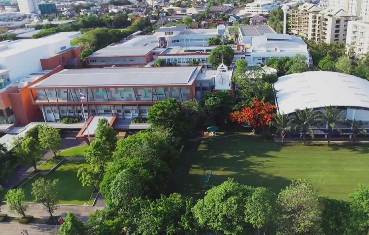
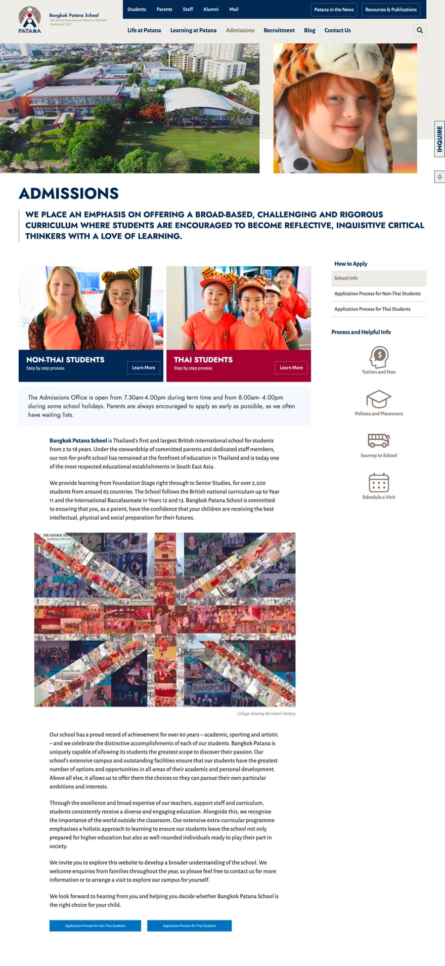
An ‘Admissions’ page is important for prospective parents so we wanted to design it with ‘Wow Factor’ in mind. That’s why the hero banner includes a wide shot of the campus.

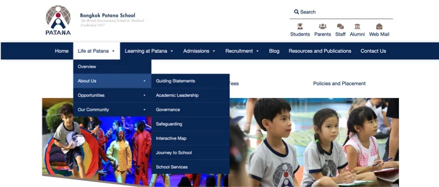
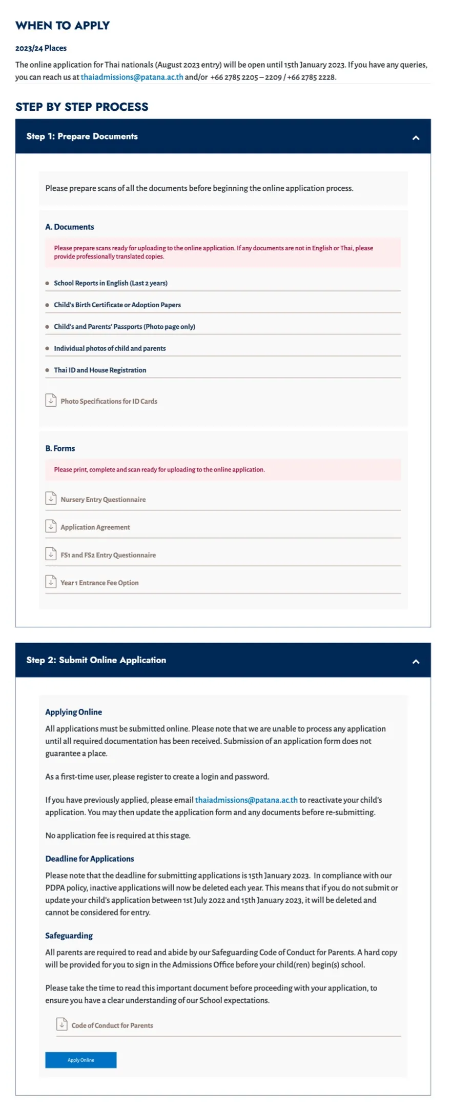
Links to key information were made more obvious through the use of icons. Buttons leading to ‘application processes ‘were moved to the top of the page.
To make reading more comfortable, paragraphs were given increased side padding to reduce the amount of words per line.
Old Admissions
New Admissions
The application process pages were cleaned up to have consistent styling and better alignment. 

Important steps were given a background warning color and downloadble documents were clearly marked with icons.
Old Application Process Dropdowns
New Application Process Dropdowns

The Blog

The new collection page uses a mosaic layout to look more dynamic when using article thumbnails with various dimensions. 
‘Jost’ is the font family used for headings. It’s really good for creating contrast with surrounding paragraph and label text.
Old Collection Page
New Collection Page
The blog article pages were given a large main image above the H1 headings to make them more impactful.  Once again, because of the H1 font family and its strong letterforms the page is divided neatly. 
Instead of listing the latest articles in a slider the new template shows the three latest posts. This was done to make the school look more active. Sliders also see low usage when they’re made in small dimensions.
Old Article Page
New Article Page

Get In Touch For A Complimentary Brainstorming Session

We’ll examine what you have now, and find the lowest hanging fruit.
Hopefully, together, we can uncover a clear path to a 10x growth trajectory.