A store designed for people interested in cryptocurrency, but who might be intimidated by having to learn the interfaces and terminology used on online exchanges. 

The Challenge

Our job was to take the cryptocurrences being traded on the BULLEX Exchange and to showcase them in the visually rich format associated with e-Commerce websites. This would require adapting the checkout process to fit.

Our main challenge was figuring out how to give cryptocurrency a form the average person could connect with since it is not a physical product.
Pictured below is the dashboard from the BULLEX Exchange website. For anyone unfamiliar with stock trading this would be intimidating.

Color & Currency

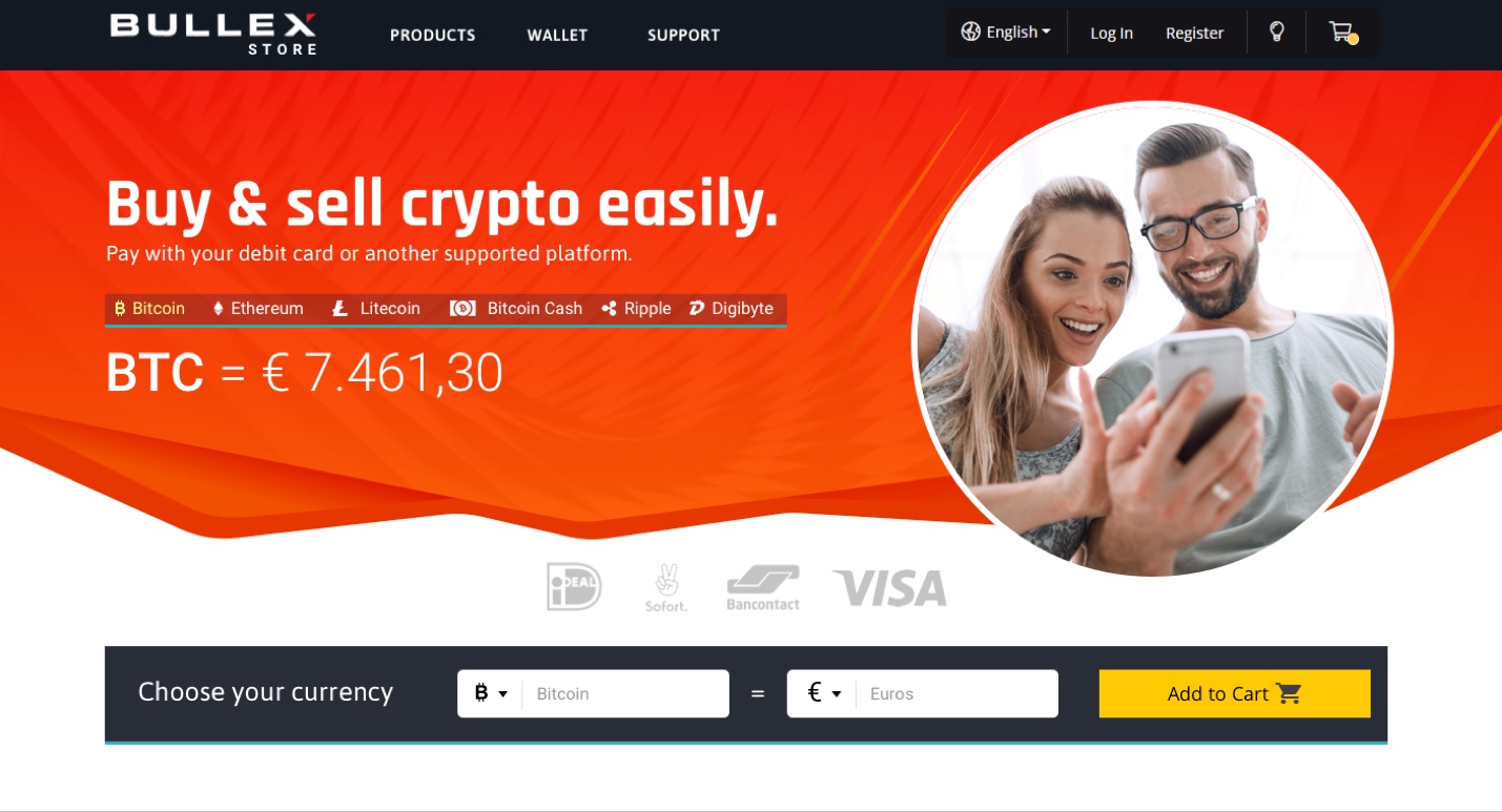
The colors of the BULLEX Exchange are ‘black’ and ‘red’. Our first draft of the store design came about as a natural progression of these colors. 

We brightened the red and added some orange highlights to make it more like a sport’s brand. 

It was an attempt at claiming a color that could help differentiate the brand from other exchange websites.

Unfortunately, it didn’t test well. There was concern that the color would remind people of trade volatility due to red and orange usually being reserved for warnings in color codification.
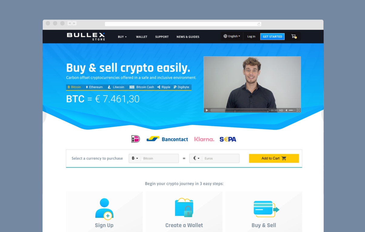
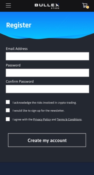
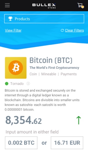
In the final design, the main color that stuck was a blue tint, which is meant to embody youthful energy and security. The website should make people feel excited and not dwell on the downsides of trading.

Onboarding

For first time visitors, it’s important to overcome any resistance towards cryptocurrency.

Visitors needed to know that assets are purchasable with their preferred payment gateways and that doing so was safe and effortless. 
That’s why the first section below the fold is simple and to the point.

Pop & Relatability

CryptoKitties served as a soft inspiration when it came to the graphics in the package section. Light-hearted illustrations showing a rounded fullness were key to appealing to millennials and had the potential to appeal to Gen-Z as they grew older. 

A Familiar Experience

We created a fairly standard layout and user interface for how products are browsed based on the most frequented online stores. The key difference in the product cards was how the values of cryptocurrencies stayed up to date while showing the the trend.

If you’re wondering, the values of the currencies inside the cart would fluctuate, but once a user started the checkout process the values would stay locked-in for ten minutes.

Mobile In mind

Great care was taken into making sure the website looked just as fantastic on mobile devices as it did on desktop displays.  

Get In Touch For A Complimentary Brainstorming Session

We’ll examine what you have now, and find the lowest hanging fruit.
Hopefully, together, we can uncover a clear path to a 10x growth trajectory.